Pastel Portrait Demo- 90 Minutes

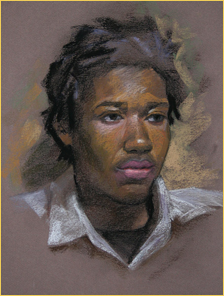
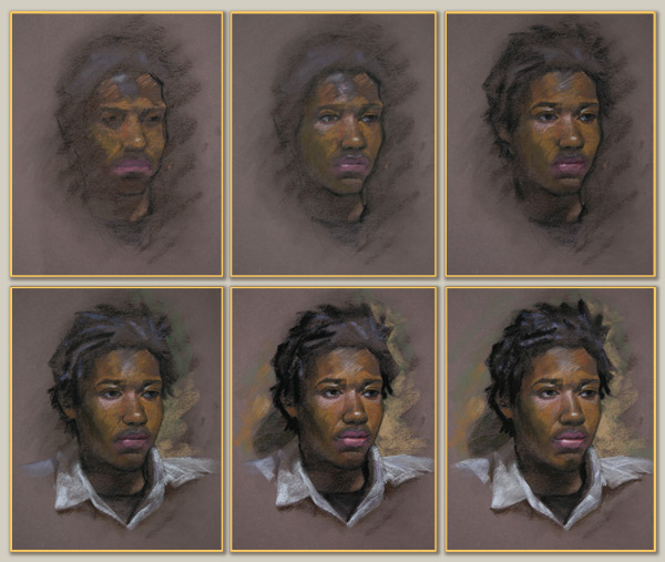
This Pastel Portrait of Joshua shows a more gradual process using drawing, shapes, and simple proportions- always working from simple to complex- general to specific- large to small. At times, a soft area of color value is floated in, then relevant measurements and alignments can be set in as landmarks to build more specific shapes and forms. Each image represents about 20 minutes of progress.

One: The Canson Mi-Tientes (Sepia) is lowered slightly in value to accommodate these flesh tones, and indications are made of placement and overall sizing. After some simple proportions are set, rough feature and shadow shapes are blocked in. A first pass of color/value is made on the light side shape and lip areas. The key right side contour is clarified with angles- simply with straight lines.

Two: Color is refined and some variations in areas added. Clarification of individual feature shapes, hair edges, and the contour of face and jaw. Highlight color/values are also placed at forehead, cheek, nose, and lips.

Three: Attention to the shapes and forms of his hair, placement of the ear, and shape of the neck. In the face, more refinement of brows, eyes, and lips in drawing and a few more additions of color/value. The collar and shirt are blocked in and developed. A simple background is begun, primarily to carve the portrait contour with negative shapes.

Four: Some lighter tones have been added into the hair, across the forehead, under the closer eye, and refinement of the eyes, nose, and lips. The core shadow along the cheek is laid in and darks added to the neck, and continuation of background work in color and edge.

Five: More work to develop the hair and it’s contour, brightening the background and adding a cast shadow. Small refinements in drawing to the eyes, nose, lips, and chin, and softening areas/edges and restating or sharpening others as needed.

Pastel can call for more restatement and sharpening more than Oils and this approach can be made in a more bold fashion- gradual work as above allows for ‘finding’ appropriate color/values and making decisions about the level of finish. This can be useful when making significant changes in subject, palette, or ground. I’ve always enjoyed working from a middle ground- the color and value of the paper affects all decisions noticeably.